This is a DS106 visual assignment that challenges us to remix an existing corporate logo with a bad font (or an improved font). At 4 stars, I think the difficulty rating is somewhat inflated. Granted, I’ve been doing this kind of work for a while, but this assignment only took me 5 minutes to complete. It is taking me longer to create and publish a post about it.
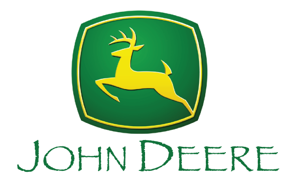
My process used was simple. I did a Google image search for the “John Deere Logo.” Then I downloaded the image and placed it into Adobe Illustrator. I used a clipping mask to remove the old John Deere Text. Then I used the text tool to reset the type in the over-used Papyrus font. I then saved the image as a PNG graphic and uploaded to this website. Boom- done! My rating for the assignment difficulty was a 1 star. For a beginner with no graphic-making experience, it might take a little longer, but certainly no more than 2 or 2.5 stars.
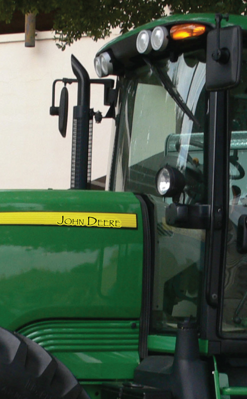
So to take it up a notch, I followed Paul Bond’s lead and put the Papyrus font onto a John Deer product.
@phb256 I followed your lead, and crap-ified a tractor’s typography. https://t.co/SGhHReLcFJ #ds106 pic.twitter.com/F9ER9enIXO
— Bill Genereux (@billgx) September 6, 2016
This took more time than the original assignment. I had to find a tractor using Google once again. Then I used the clone tool of Photoshop to remove the original John Deer lettering. I tried using Photoshop to add the lettering back in, but I wasn’t pleased with how it turned out, so I saved the edited photo as a JPG and brought it back into Illustrator, where I used the text tool to set the type. I then saved the photo as a web ready JPG image. Here is the result: