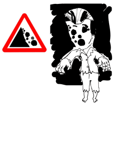
This is a visual communications assignment we are working on in my Digital Media 1 class. The idea is to take an ordinary road sign and reinterpret it to show what is going on beyond the sign’s borders. I love playing with negative space, so this is what I came up with on the falling rocks road sign. Thanks to DS106 for another great design assignment.
