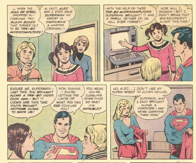
from Archive.org. https://archive.org/details/Superman_Victory_by_Computer_1981_DC_Comics_Radio_Shack_US/page/n9/mode/2up
A two-year project, drawing on the collections of the British Library and the Bibliothèque nationale de France, has made 800 manuscripts from the period 700 – 1200 available online for the first time.
https://www.bl.uk/news/2018/november-2018/800-medieval-manuscripts-now-available-online#
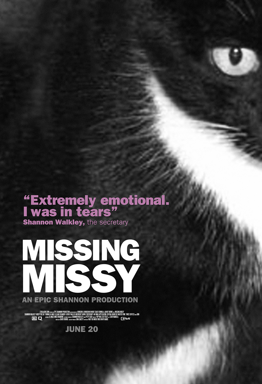
I found this story by David Thorne about a missing cat several years ago. I always laugh out loud every time I revisit it. I love sharing it with my design students when the topic of conversing with design clients comes up. Please enjoy: Missing Missy.

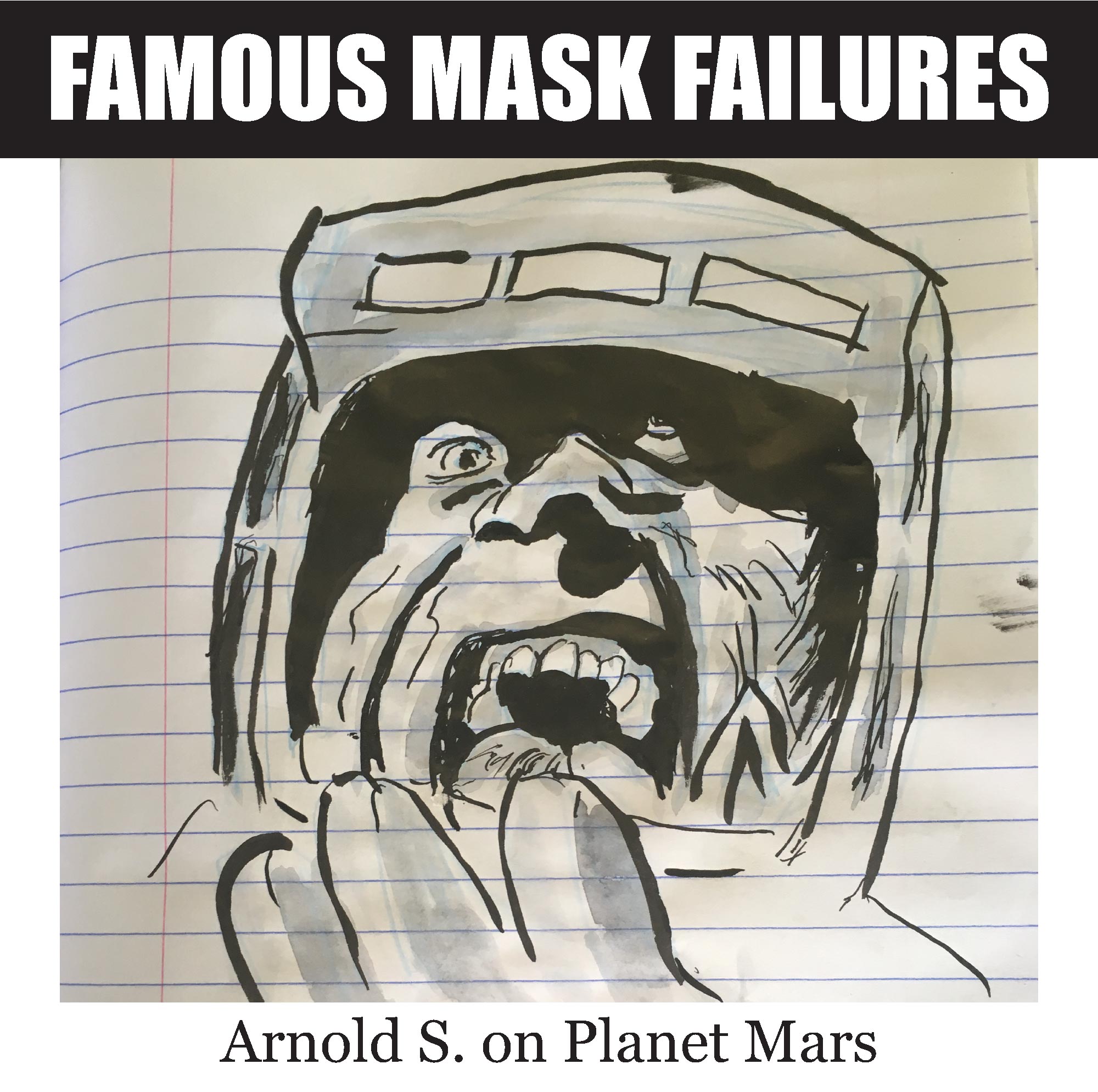
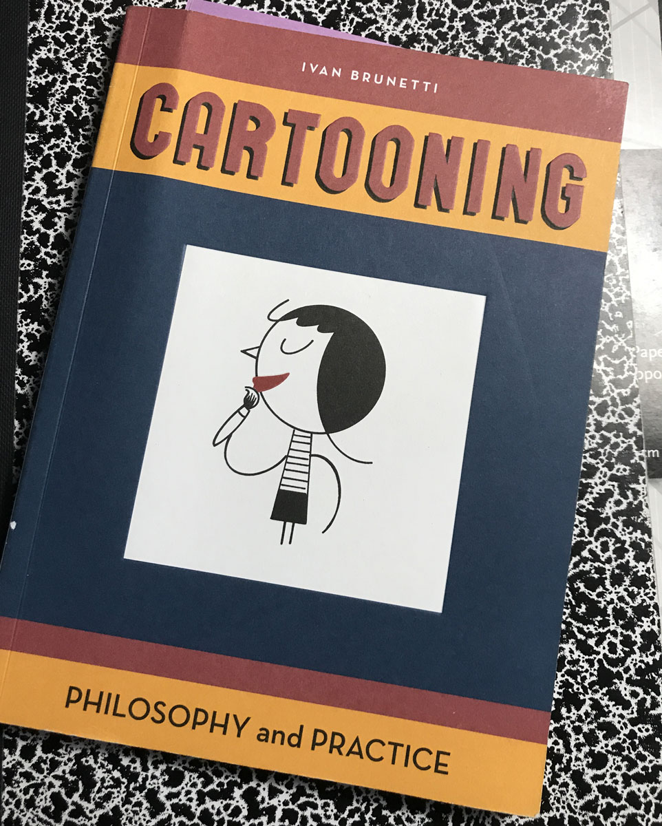
 Page 34 of the Brunetti book on Cartooning calls for three single panel cartoons paying attention to action within an identifiable place, line quality , composition and areas of solid black. This is the first of my three.
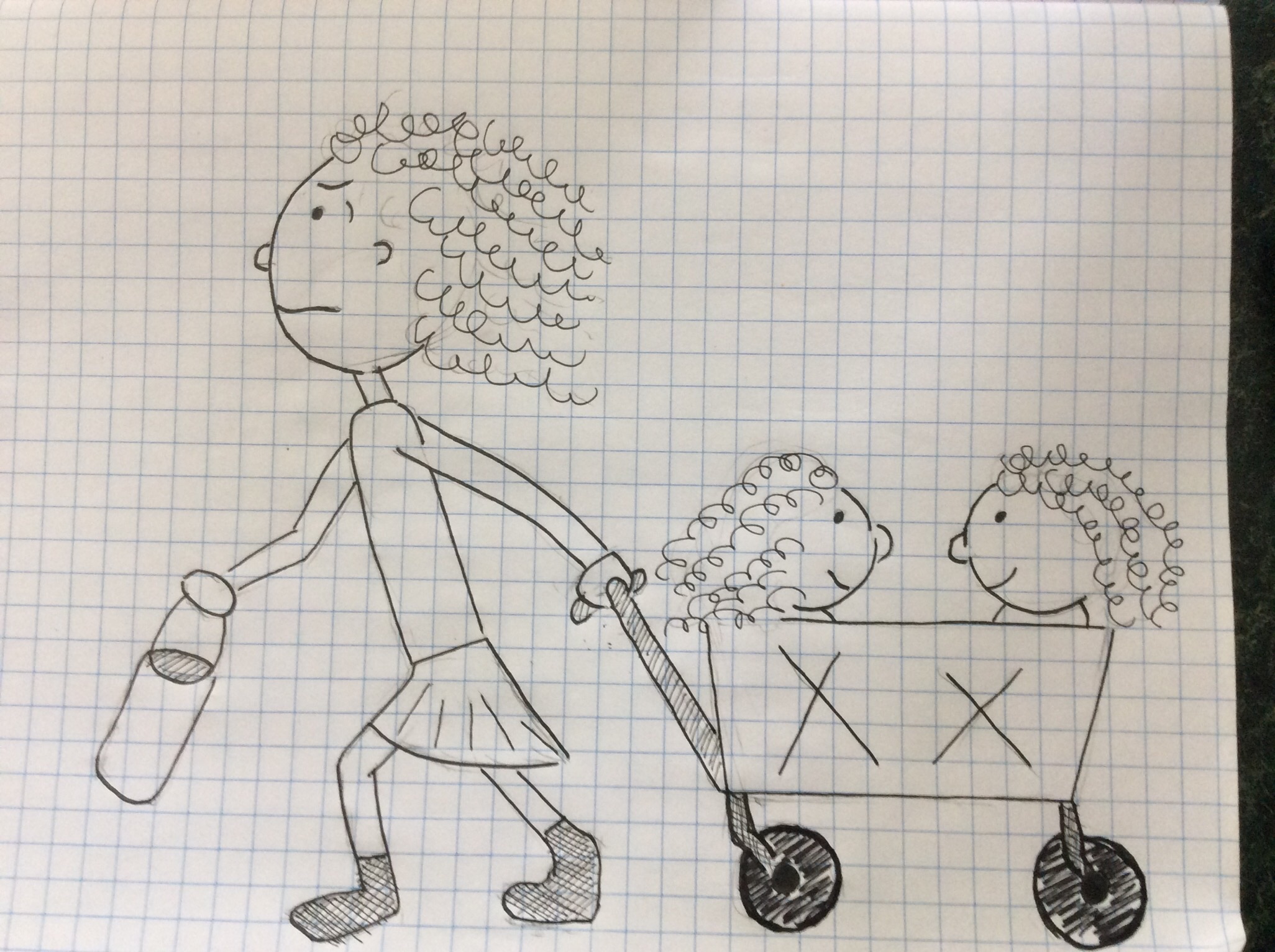
So far as an identifiable place goes, it may be that only people who do summer league sports recognize this location – a ball park. I saw this harried mom pulling two little girls in a collapsible wagon that is common to families who travel to various ball parks across the country.
I didn’t really make any areas of solid black, opting for hatched areas of gray instead of solid black. Didn’t really think about using solid black.
I purchased Brunetti’s Cartooning book for Kindle some time ago. I started doing the exercises but didn’t stick with it for very long. You know, work, life, and things. I recently ordered a hard copy of the book hoping that seeing it lying around in my work area would be more of a reminder to me than a bunch of bits buried somewhere deep in my Kindle would be. Below are some of the first week’s efforts.
Draw cartoon characters from memory:

Draw 100 sequential five second sketches of whatever pops into mind representing a stream of consciousness:

Make a composition of many drawings using a unified theme:

After coming across the Near-Sighted Monkey’s post on using a drawing exercise for taking attendance, I had to share it here. This is absolutely the most creative way I’ve ever seen for taking attendance in a class. Starting with an original drawing, each student was to copy the drawing exactly except substituting the face with a drawing of their own face.
I love the idea of giving a creative assignment like this for taking attendance. I’m going to think about similar creative ways to take attendance in my classes. Well done!
I am working with Adobe After Effects in the motion graphics class. One of the popular uses of this software I’ve seen in putting type into motion – sometimes known as ‘kinetic typography.’ This week I’m looking at examples of this kind of work. I’m using this post to collect the examples so I can refer back to them. Maybe someone else can find them useful as well.
I found a post of 34 ‘Must See’ examples of kinetic typography, so I watched them all. I’m sharing some with comments below:
We watched this one in class, and it is pretty flawless. The only thing I see that could improve it is doing the entire song. I seem to see a flickering effect, that simulates what you would sometimes see if you watched a movie through a film projector. I also like how things seem to zoom in and out. Everything is not on a 2-D plane, things appear to get closer and farther away as well.
This one was amazing. One there are lots of textures and vibrant colors. I really like the simulated 3D effect. There is something like confetti floating around a rotating pyramid in the background. That would take a lot of work to create in AfterEffects. I wonder if some other form of 3D software was used instead?
This is a great book, and a great piece of kinetic typography. I really like how certain words are emphasized by using a different font or style of type. I also liked how words appear horizontally, but sometimes rotate for emphasis.
This one strikes me as more of an animation than what we would consider ‘kinetic typeography’ but I include it nevertheless.
This one is really fun. Probably my favorite so far! We lead off on a simulated highway scene, with the text moving down the road in perspective. I’m blown away by the use of textures. Everything fits. For example, when the bathroom is mentioned, we see a fuzzy bathroom rug or towel background. I also liked how certain corporate logo motifs were used. The words appear, popping open like bubbles or something. Lots of graphics. Yes, this is my favorite so far.
This one makes me seasick. And I’m an ex-sailor. Who never got seasick.
I like the sound effects in this one. I wonder if I can somehow use sound effects like this in the piece I am planning?
I like this one mainly for its simplicity.
This one uses a lot of cute graphical elements in the classic Beach Boys song.
I liked Ira’s message more than the typography on this one. While I appreciate simplicity, this one was too simple. I don’t think the type really added anything to the message.
Ok, I think that is enough for now. Now I need to move on to thinking about my own piece I’m planning. More on that soon…
A second layer tennis match happened while @DangerRanger11b and I were going at it on the other court. This one was between @a_merrymary and @fenderbendr1994. @a_merrymary served this picture:
@fenderbendr1994 #ds106Layers Round 1 pic.twitter.com/aUi9ahw7ij
— Mary Ewers (@a_merrymary) September 29, 2015
and @fenderbendr1994 returned with this:
.@a_merrymary Come at me, bro. #ds106 #ds106layers pic.twitter.com/lon98msf6E
— Nicholas (@fenderbendr1994) September 29, 2015
then @a_merrymary quickly slammed this one back:
@fenderbendr1994 #ds106Layers Round 1 pic.twitter.com/UG5HTUVcyT
— Mary Ewers (@a_merrymary) September 29, 2015
which was responded to with this:
.@a_merrymary Round 2! #ds106 #ds106layers pic.twitter.com/mfR04Z9FPV
— Nicholas (@fenderbendr1994) September 29, 2015
Following a new line of thought was @a_merrymary
@fenderbendr1994 #ds106Layers pic.twitter.com/JQFTm1NpCE
— Mary Ewers (@a_merrymary) September 29, 2015
to which @fenderbendr1994 dinked this:
.@a_merrymary Round 3! #ds106 #ds106layers pic.twitter.com/f5U9qcT5bx
— Nicholas (@fenderbendr1994) September 29, 2015
and @a_merrymary slammed home this surprise ending:
#ds106 #ds106layers Round 3! pic.twitter.com/ewEGv3NTeo
— Mary Ewers (@a_merrymary) September 29, 2015
Well played, you two!