Photography and the Visual Image
This week we will be looking at visual storytelling through images and photography. How does one make a good photograph? This year I have amassed a huge collection of family photographs. Literally hundreds of photo prints made by different members of my family over the years.
We really like picture-taking in our family but if I am brutally honest, most are mediocre, unremarkable snapshots. (My mom was a big fan of double-prints too, so often there’s twice the amount of prints too.)
What is the difference between a snapshot and a composed photograph?
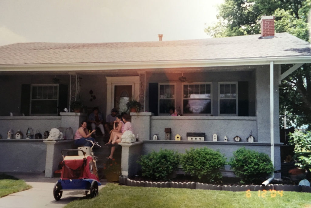
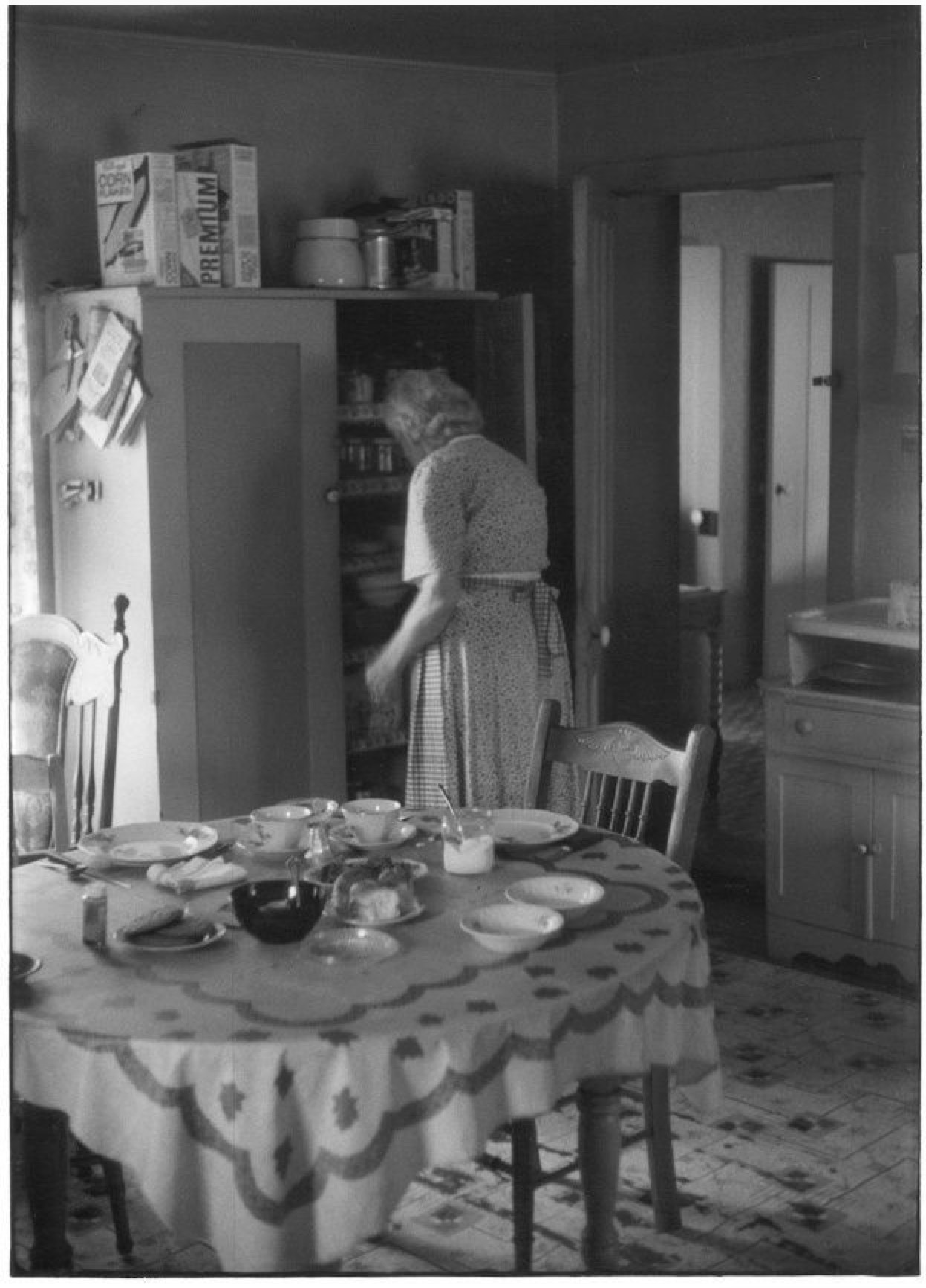
Snapshots are made by people with no formal training and lack having a natural eye for composition. In the snapshot above, there are some things I like and some things I don’t care for at all. I can see a front view of the first home I purchased (we no longer live there). On the porch is a gathering of my siblings, and I see a stroller/bike trailer on the sidewalk.
I can see my wife’s birdhouse collection and my family, but no details on either. In a composed photograph, the photographer identifies the key subject and emphasizes it. The photographer composes the frame and decides what to include and exclude. That is the job of the photographer — to tell the viewer what is important to see and what is not. (By the way, this fact is foundational to being media literate. All media are constructed. Media creators include and exclude things based on their tastes, preferences and biases. To be media literate, we must realize this fact when we view the work of others.)
What is the main subject of the above picture? It is hard to tell, isn’t it? Is it the house? Is it the decorations and landscaping of the house? Is it the family on the porch of the house? The bicycle and bike trailer? There is a lot going on here and the photographer decides to try to include everything; that is wrong! Well not wrong if you are making snapshots, but wrong if you want to make memorable photographs. I would much prefer to see faces up close, or certain interesting features of the house, or even the bike and trailer. I have literally hundreds of snapshot pictures and maybe one out of ten or twenty strikes me as really interesting to look at.
This next picture (below) is also from my vast collection of family photos. Although technically, this too is a snapshot made on what was undoubtedly a less complex camera than the previous photo (a Brownie camera perhaps?), it seems the photographer who made this one was more conscious of design elements that make a good photograph, or at least they lucked into using them.
The very first thing that strikes me in this photograph is the use of the Rule of Thirds. Notice how the subject, the two women, are not placed exactly in the center but are instead more towards the left. This automatically makes a more interesting photo to look at. Placing a subject dead center is static, and boring.
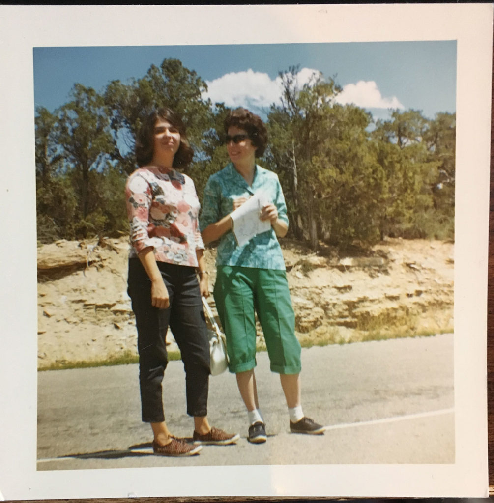
The photo is likely from the 1960s and I love the still-vibrant colors in this outdoor scene. Many photos of this age have faded, particularly the blues and greens and many photos like this have the reddish hue of age. Not this one! It has probably been kept in a relatively cool and dry environment out of the sunlight.
The mother/daughter duo appear to be wearing clothing of a similar style, although not matching. The similar cut of their tops (look at the angled waist hem) makes me wonder if they bought these clothes while out shopping together. I like that it is close enough to see their faces, yet far enough back to include their entire bodies. It is obvious that the people are what the photographer wants us to see. The background is simple. Rocks, trees and sky, and they are standing in the middle of the road which tells me this is an off the beaten path sort of place without throngs of traffic.
This is such a fun photograph, I attempted to make a small watercolor painting of it. I will probably try the same scene again to see if I can improve my technique any.
To recap, to make a quality photograph you need to select a definite subject. Make it obvious. Don’t make the viewer have to guess what you are trying to show us. Then to increase interest, put the subject not in the center, but off to the side using the Rule of Thirds. Finally, consider the colors and lighting of the scene. In my second example photo, the lighting is strong and bright, which caused the human subjects to squint and to wear sunglasses. It also creates harsh shadows, which are often undesirable. If you make photographs on overcast days, or in the shade, or during the dawn and dusk hours when the sun is low in the skies you can get really interesting results with your natural ambient light. If you do these things, the quality of your picture taking will likely move from simple snapshots into the realm of true photograph.

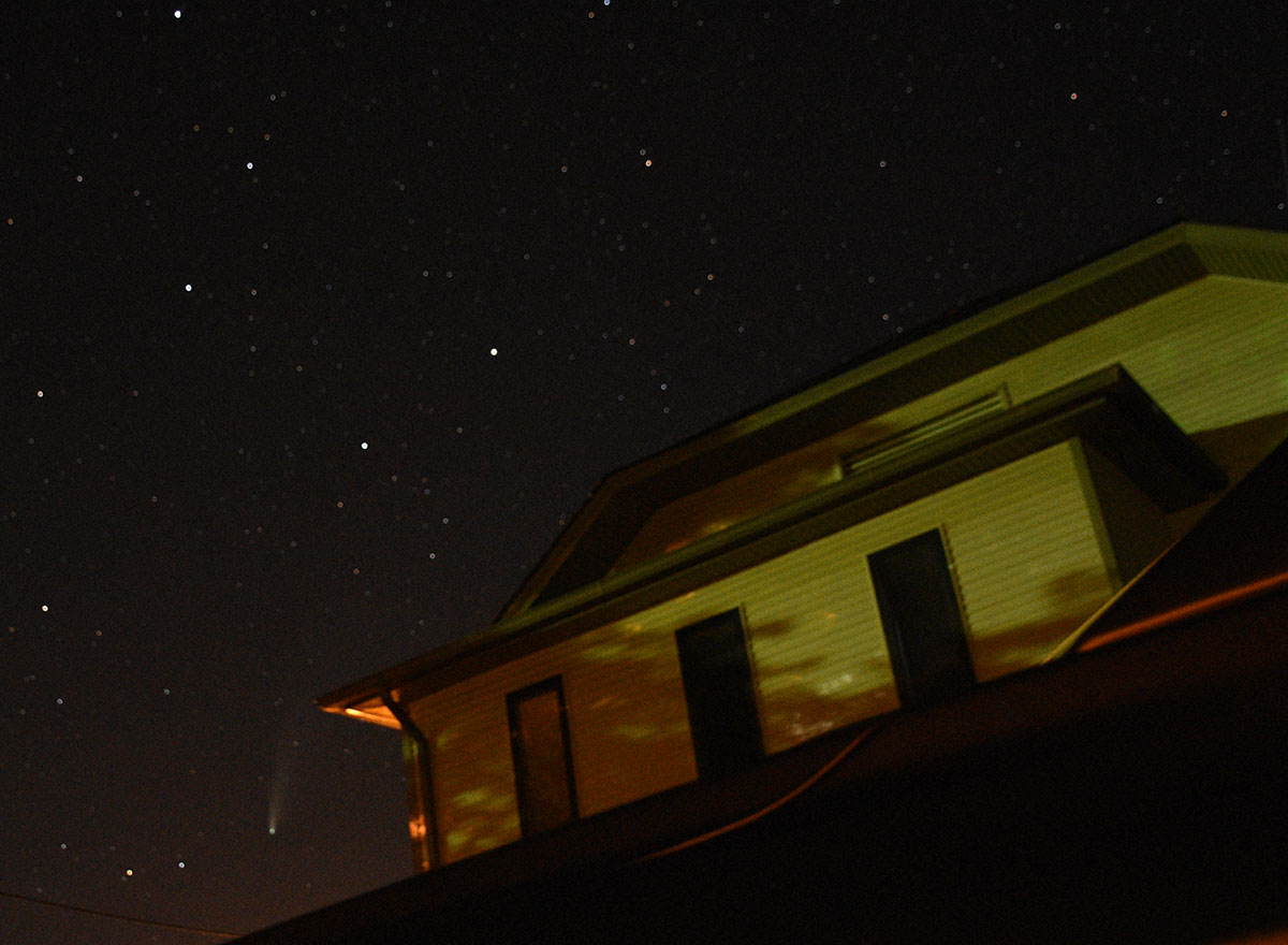

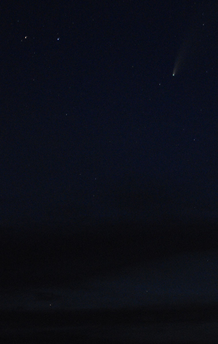
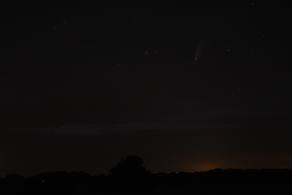
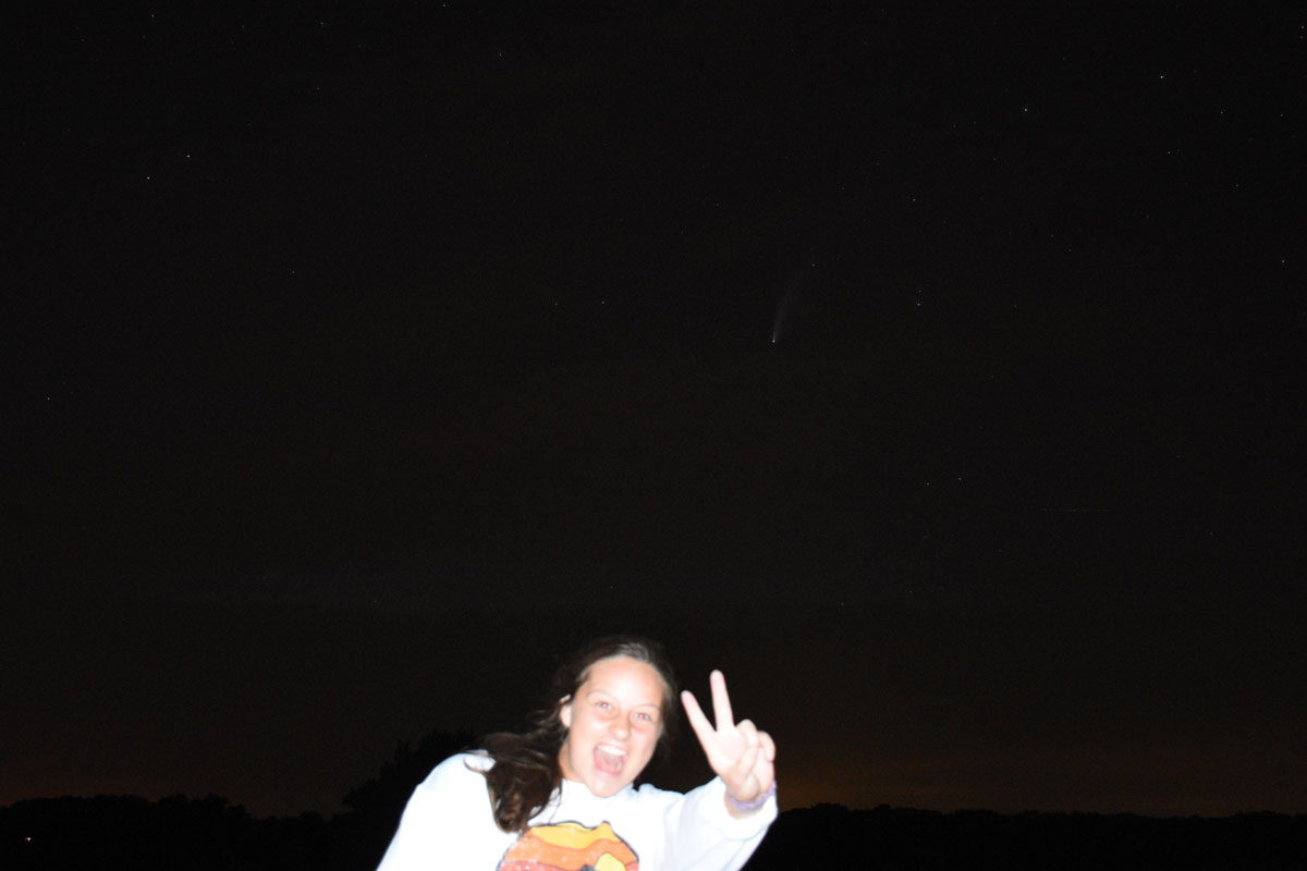
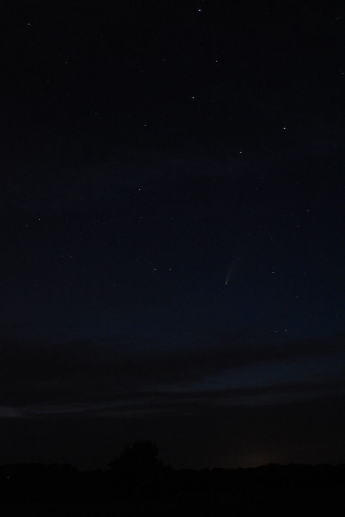 We finally started to be able to see the comet pretty well.