Category Archives: cartooning

Cartoon Drummer Drawings

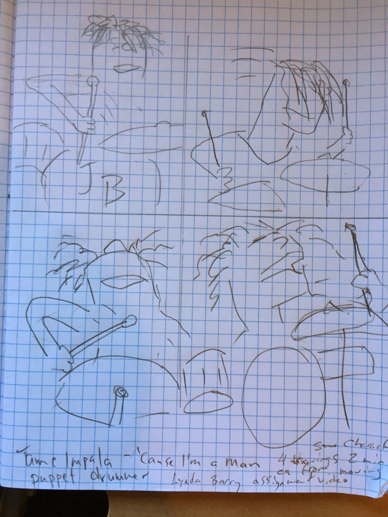
I found this assignment from Lynda Barry about drawing a puppet in motion from this video:

She said to choose one of the band members, divide a page into four quadrants then make four different drawings in different poses of the same character while watching the video in motion without stopping it. She said to set a timer for 2:00 minutes in which to make each drawing. It is a challenge, but it is supposed to be a cartoon so it could be more interpretive rather than a fully rendered work of art.

Here is what I came up with…

four drawings of a cartoon drummer

I like how I picked up on specific elements to feature in each drawing. Like the bottom left one, I noticed his head was thrown way back so you couldn’t see the top of his head at all, only his nose sticking way up in the air. I think my drawings became progressively more successful as I became more at ease with trying to draw a moving subject.

Favorite / Not Favorite

This is assignment 8 in Ivan Brunetti’s Cartooning book. The assignment asked us to find a  pair of comics that we consider as our most and least favorite. I chose The Far Side as my all time favorite comic and at first I thought I have no least favorite comic, but finally chose Nancy as my least favorite. Now that I think back to my childhood, I also didn’t care much for Brenda Starr and Dick Tracy, but Nancy was the one that came to mind first.

In analyzing the Nancy strip, one thing that I noticed is the characters seemed ugly and angry all of the time. Of course, Nancy’s mother (or is it her aunt?) is drawn to be very beautiful as a contrast to the children characters, but she doesn’t appear very often. Also, I think the strip is pretty two dimensional in appearance. I don’t care much for Nancy’s prickly-pear cactus hairdo.

Speaking of cartoon hairdos, I think no one tops Gary Larson’s The Far Side beehives on his women characters. Each of his characters and scenarios are zany and imaginative.

Assignment 8 asks us to draw a “least favorite” panel in the style of the “most favorite” and vice-versa. I really love this assignment because it gets you thinking about the specific things you like most about your favorite but also helps you to identify aspects of your least favorite that are exemplary.

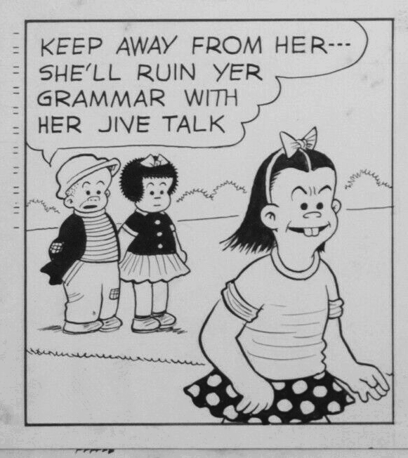
My first panel is of a Nancy comic drawn in Far Side style. The Far Side never has speech balloons inside the panel but rather has captions below so I’ve followed that format with this one:


Keep away from her… She’ll ruin
yer grammar with her jive talk.

Here is the original panel I used as a reference:

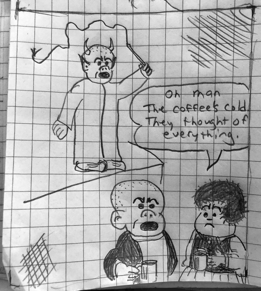
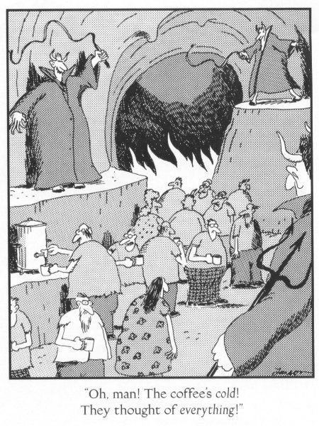
Nancy dedicates a lot of real estate to speech balloons and there does not ever seem to be much background detail. So when I drew Larson’s depiction of Hell, I removed most of the people and the hellish details. I think if I were to redraw this, I should probably re-do the composition allowing room to at least show some fiery flames. I think I took simple too far, and I didn’t leave enough room for the speech balloon.

Below is the original Far Side panel I reimagined in the new Nancy style.

Young Evel Knievel

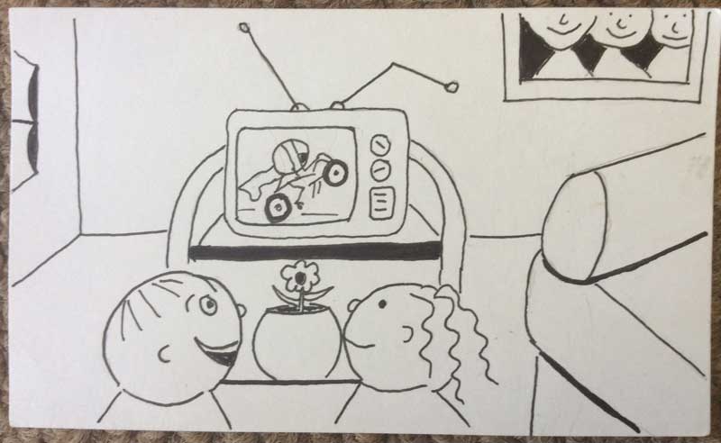
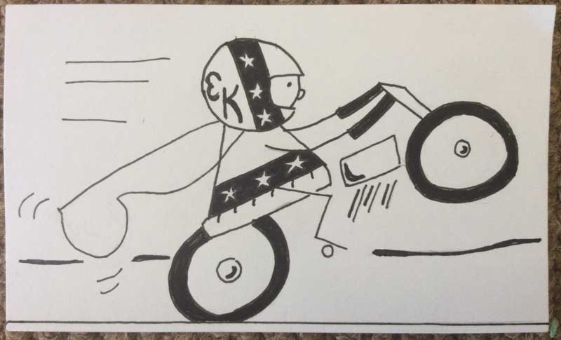
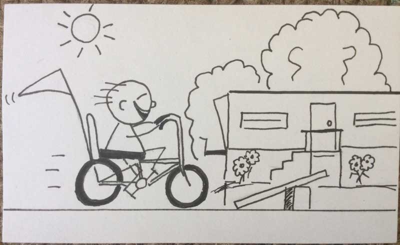
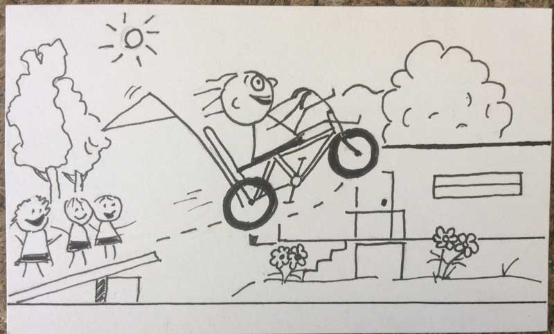
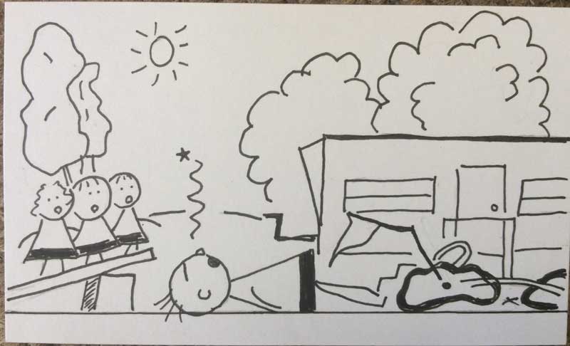
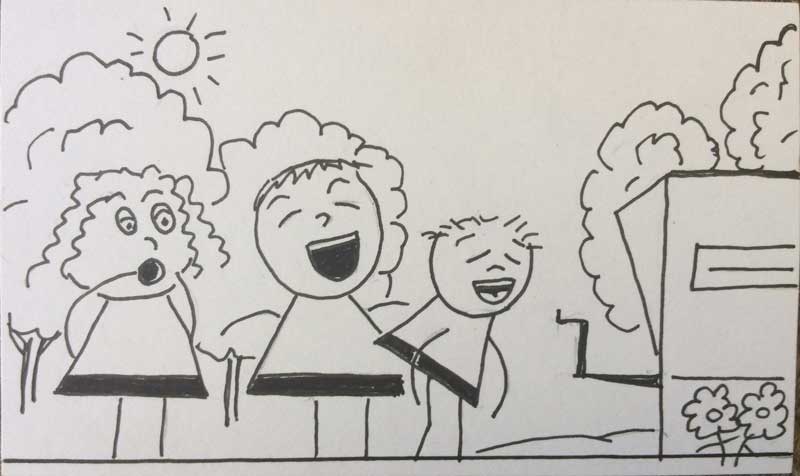
Somewhere in the mid-1970s, like many kids of the time, my friends and I came under the influence of daredevil Evel Knievel. We decided to set up boards as ramps that we could jump our bikes over. If we were really daring (only the older kids tried this) someone would lie down beside the ramp and allow a bicyclist to jump over them.

Of course, no one ever heard of a bicycle helmet in those days, so all of our stunts were done without a safety net or any form of safety, really. Today’s cartoon is an assignment from the Ivan Brunetti Cartooning book and is a story about a childhood memory involving one of these ramps in the street in front of our house. It went something like this…

Note: I was ok. But wow, what a crash!

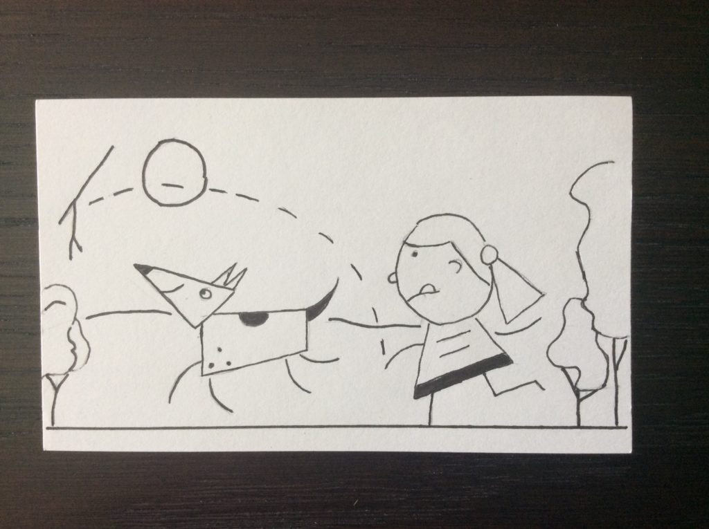
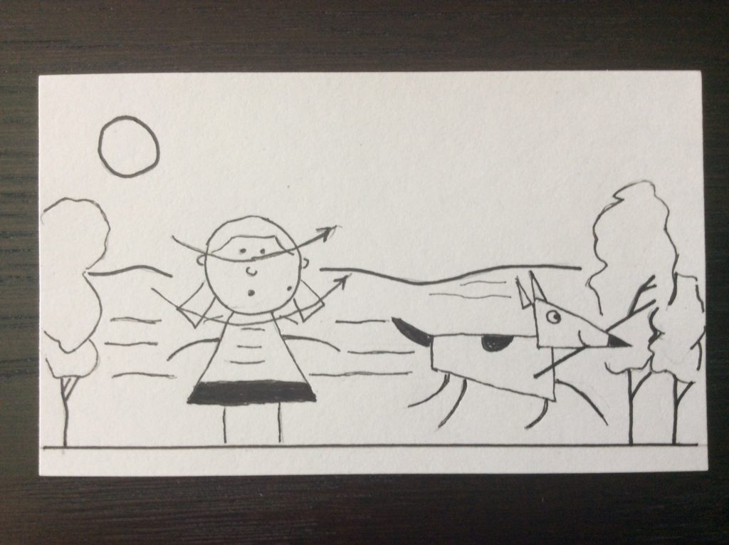
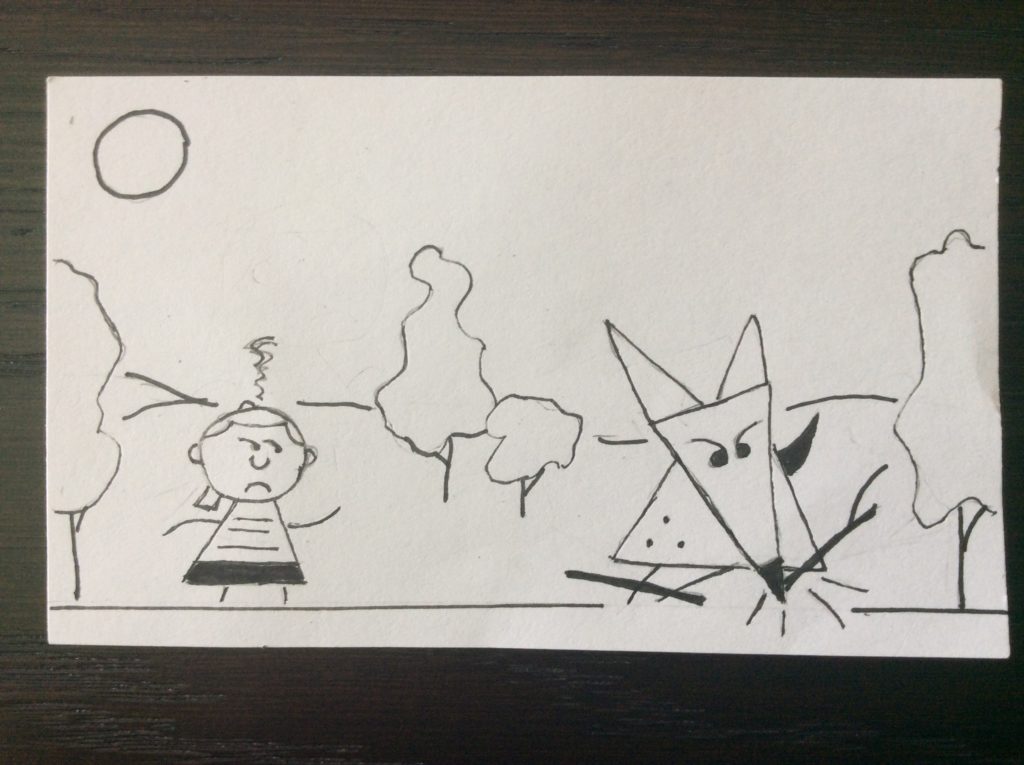
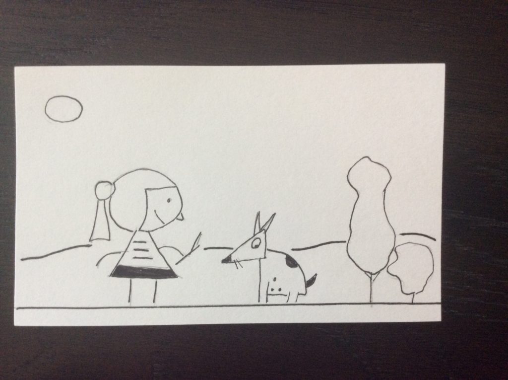
Go Fetch

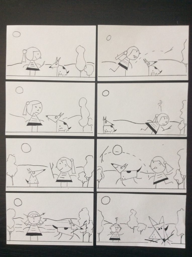
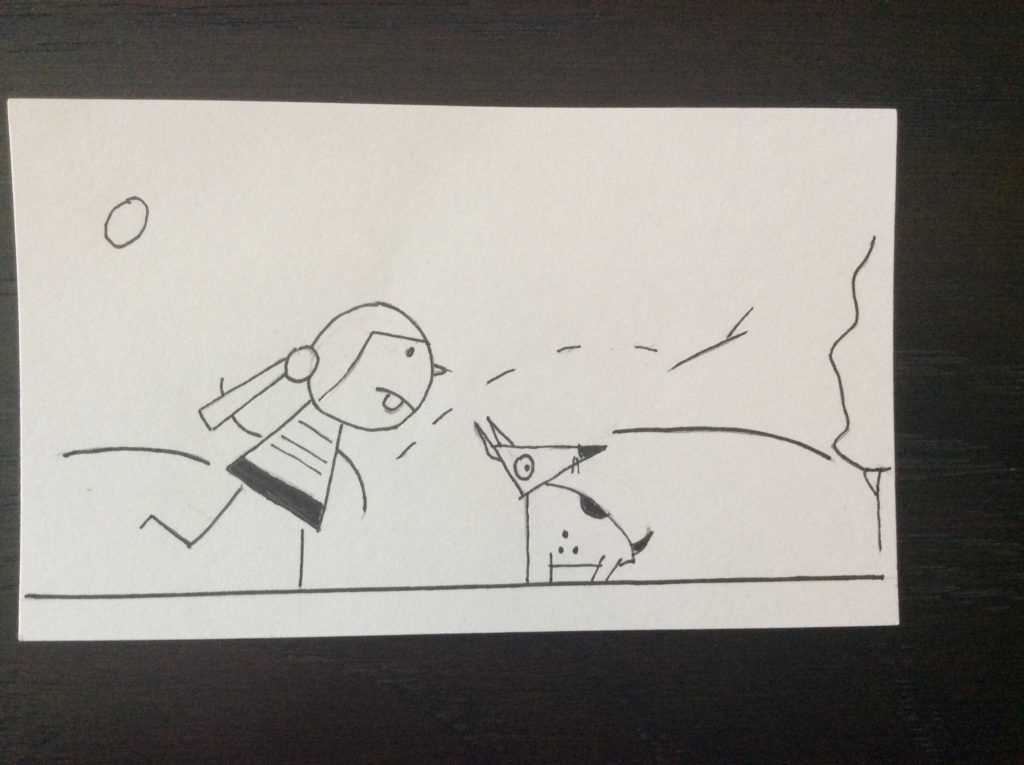
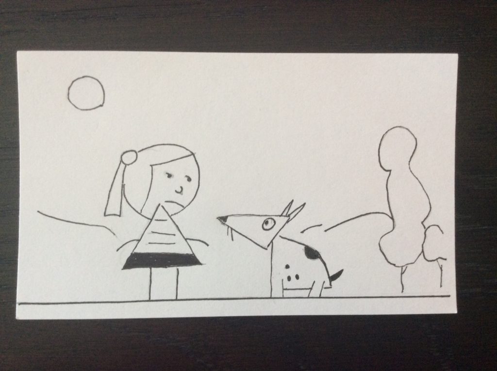
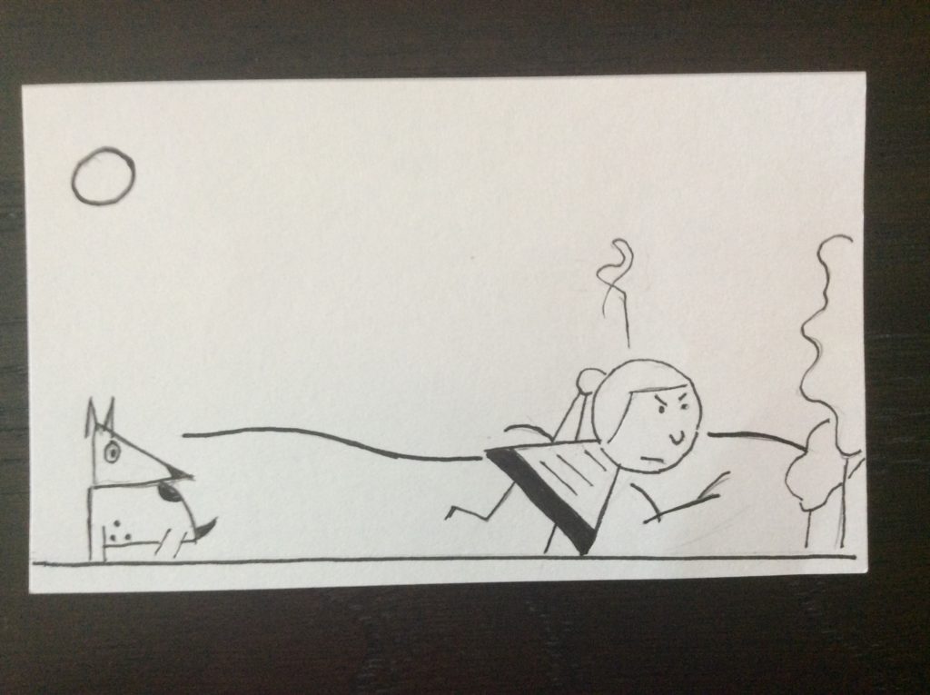
This is a project from Chapter 4 of Ivan Brunetti’s Cartooning book. Create a character, an action, a location, then tell a story using only images and no words. I started working through this book several years ago, but didn’t make it very far. I resumed work this summer when presumably I would have some extra time on my hands. Ha! That’s funny. I’ve been constantly on the go.

But this week has provided me some relatively free time, so I did this project that required first to make four frames telling a story, then four more frames that adds more detail. The above sequence shows the result of that effort. It took me around five hours or so to make what you see here from sketching out different ideas and concepts to solidifying and building on a story.

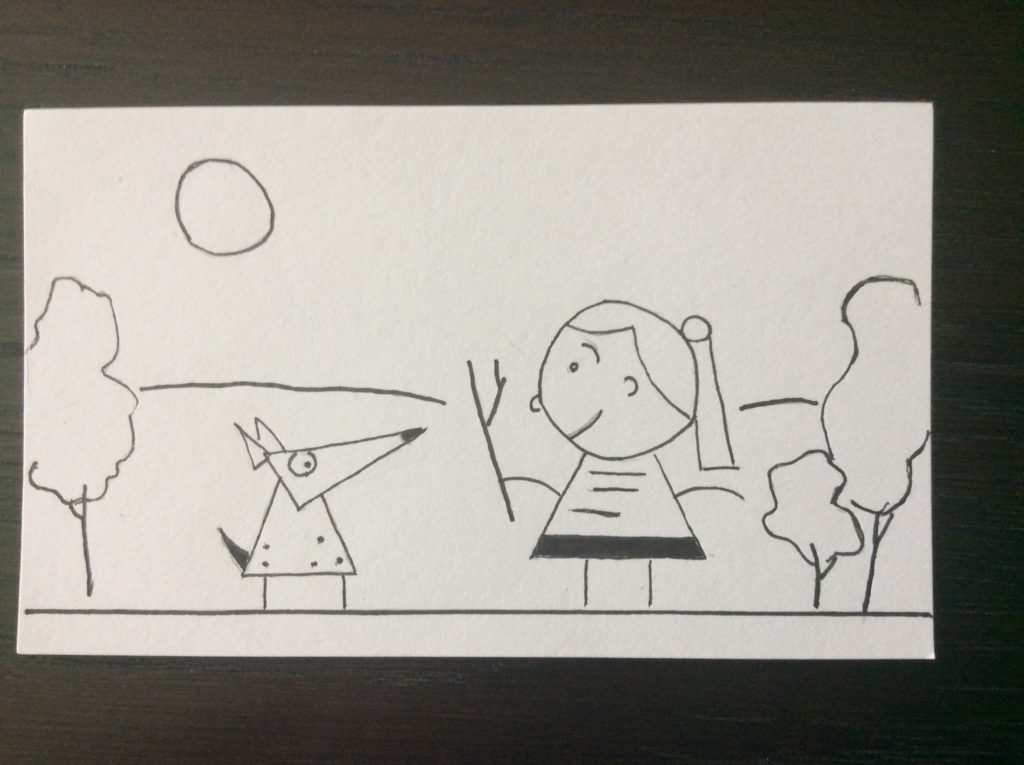
I decided to tell a story that describes my Blue Heeler dog Daisy. I started out with a girl character using Brunetti’s simple geometric shapes. A circle for a head. A triangle for a body. Little lines for arms and legs. Add some decorations and that’s it. Then I played around with a doggie character also in simple shapes.

I think keeping things simple like this keeps the  focus on the story. I also think this approach might be useful in a class project with students that encourages visual storytelling without requiring an extensive background in art .

Even with the simplified forms, right away I see the flaws in my drawings. There are compositional issues. There are better solutions to problems, I think. See the second to last frame? I wanted to convey the dog zooming by the girl without stopping but it seems really rough here to me. I think one or two frames have too few environmental elements, and some of the others too many.

I’m experimenting here trying to get a good feel for what is the right amount. I want things to be visually interesting without being overwhelming. But this is a starting point, and I have finally resumed work on something I’ve been wanting to do for a while now. The Cartooning book.


Childhood Fort

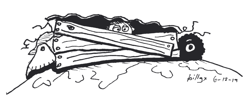
When I was about eight or nine, the neighborhood kids and I built a fort made from items we found in a pile of junk not far from my house. It contained discarded construction materials like lumber and corrugated tin, some broken household appliances, tires, scrap iron, and other suitable materials that a group of boys could work with.

I was one of the younger kids involved in the project so I was elected as the one to test our fort’s strength against attack. I sat in the fort while the bigger kids hurled dirt clods at me. As it turned out, the fort was not a good defense at all against dirt clods and I caught one in the eye. I came out bawling and was certain that my eye was a useless pile of mush.

They continued improving the fort, while my mom doctored me up, and fortunately, I suffered no permanent damage.  This incident would have happened a couple of years before I was diagnosed with myopia and have been a wearer of eyeglasses ever since. I’m not sure if wearing eyeglasses would have made things better or worse in the fort incident.

I don’t know who the next “guinea pig” was, but I didn’t serve as a “fort tester” going forward with our building project.

Cartooning Week 3

I’m falling behind on my cartooning efforts. I made these drawings for the first assignment in Week 3 of Brunetti’s cartooning book last weekend, but haven’t had a chance to reflect or write on them until this morning.

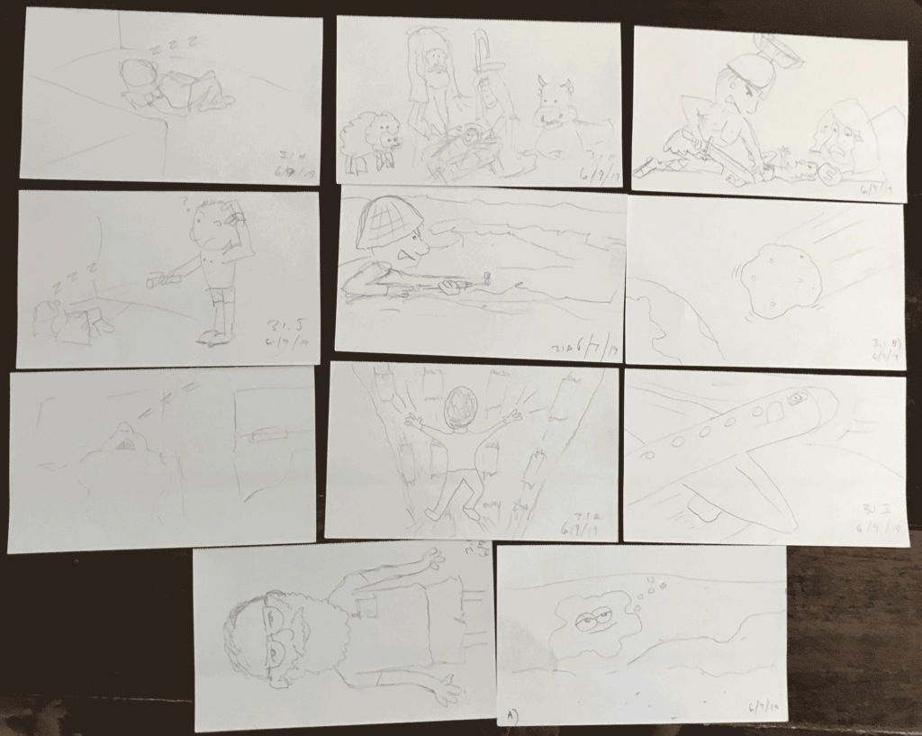
For Exercise 3.1 Brunetti says to draw 12 scenes on notecards with prompts he gives like “beginning of the world” “end of the world” “something that happened at lunchtime” “an image from a recent dream” “something that happened early this morning” “something happened right after that” and so on.

These are drawn on notecards in order to facilitate arranging the scenes into a four-panel sequence noting the type of narrative you prefer, what visual elements connect the scenes, breaks in the narrative, reordering the scenes and so forth. According to Brunetti, “the haiku-like rigidity of the four-panel structure allows us quite a flexible starting point.”

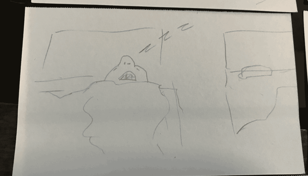
One of my favorite sequences was “something that happened early this morning.” We spent the night in a hotel for my daughter’s softball tournament. I woke up in a panic because she wasn’t in her bed. I found her sleeping on the floor. All the while, her mother was sound asleep, oblivious to my panic over our missing child.
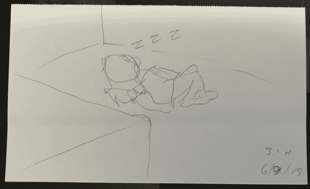
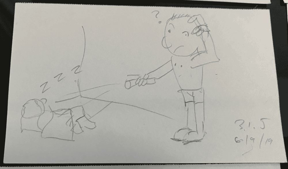
I wasn’t really able to make a four-panel sequence using that, as I only drew three scenes of it. But I did rather like the nightmare sequence of the person falling, the D-Day invasion, the asteroid falling towards the earth and the person in bed sleeping. I think that one worked with the sleeping person either at the end or the beginning of the sequence.

I think the ideas are connected by being nightmarish scenes, then the relief that they are only dreams. When I compared my 11 cards (I didn’t get the 12th one made) with Brunetti’s example in the book, I noticed that each of his panels (except one with an animal character) featured a person in it, whereas mine did not always prominently feature a character.
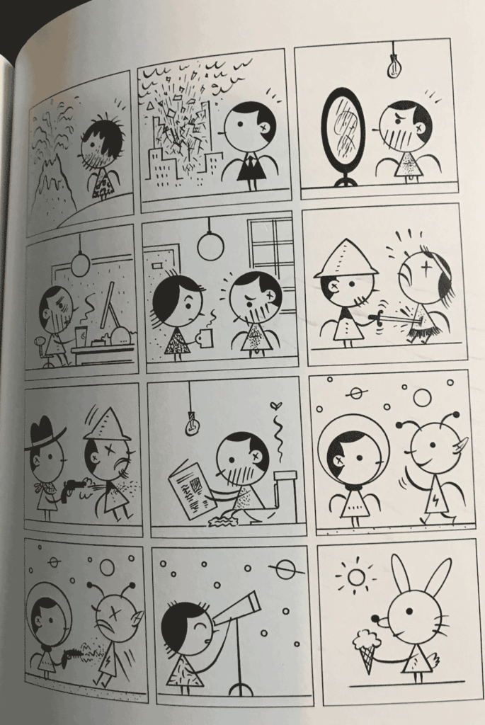
The other thing I noticed is his style of drawing characters with simple geometric shapes and background elements gives a consistency of visual elements in every panel. I don’t really have anything like that. He draws a line for the ground in every single scene. Many of mine have straight line elements, but some do not. He also uses a circle in the background in most of his panels, either a light fixture, the sun, or stars and planets in the futuristic scenes. This gives his work a distinctive and recognizable quality to it. He’s found his visual “voice” whereas it seems I’m still searching for mine.
Cartooning Homework 2.1

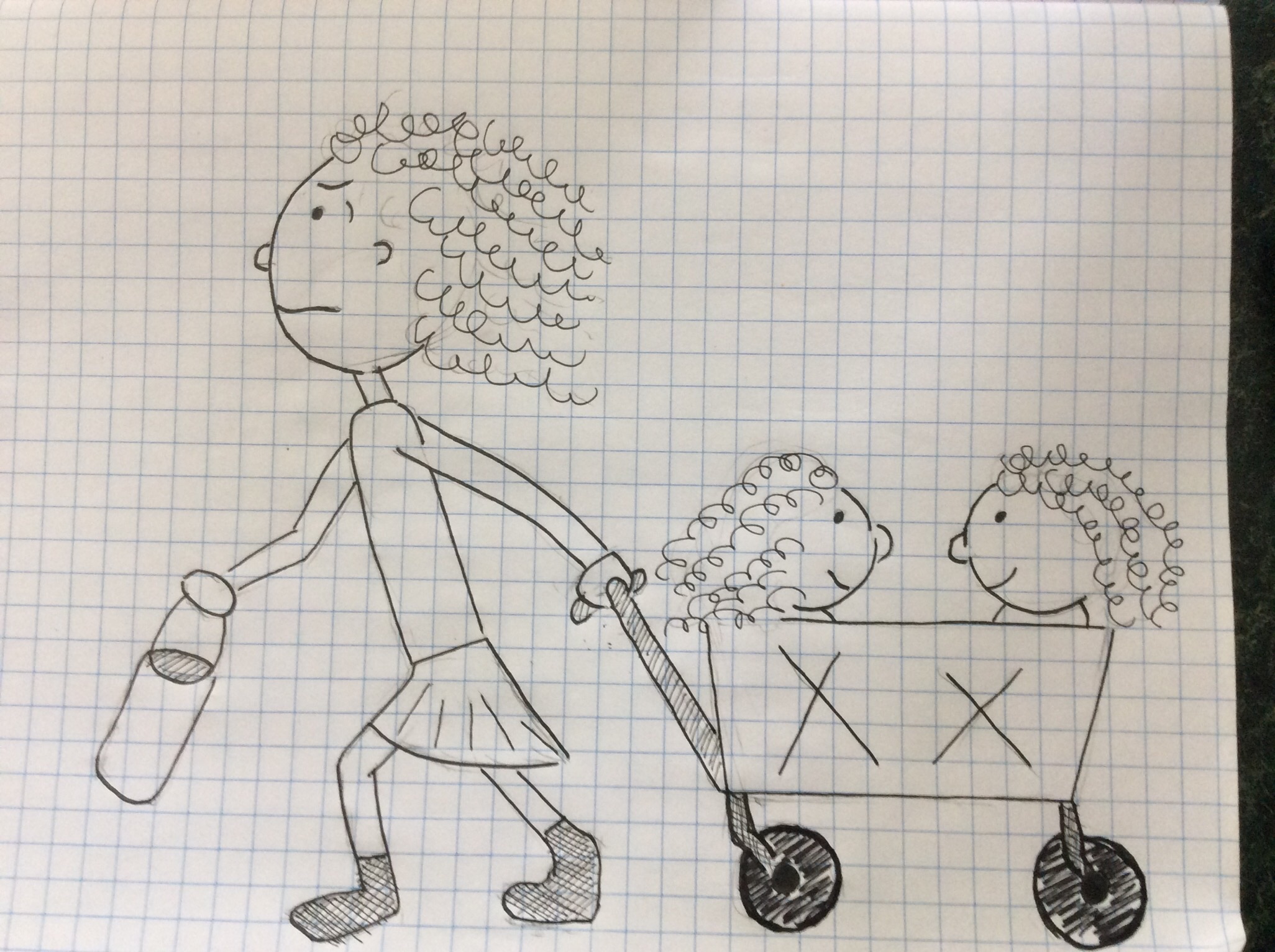
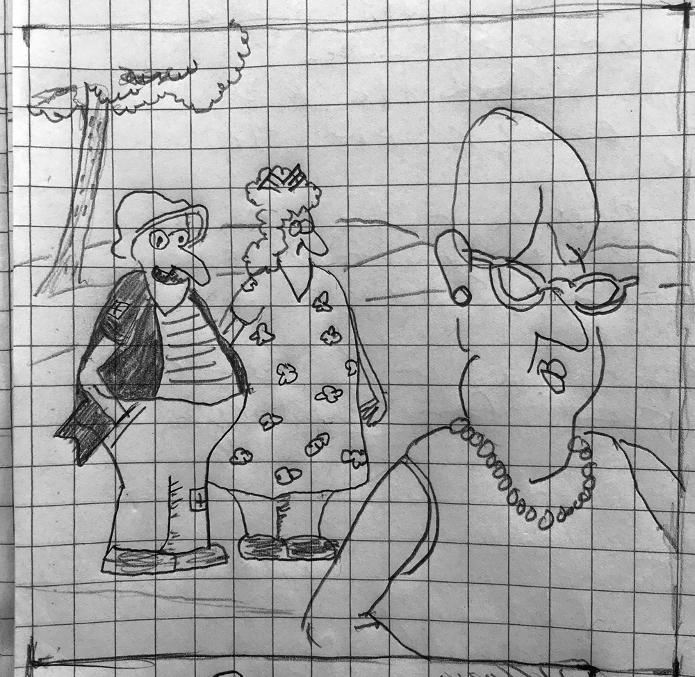
Page 34  of the Brunetti book on Cartooning calls for three single panel cartoons paying attention to action within an identifiable place, line quality , composition and areas of solid black. This is the first of my three.

So far as an identifiable place goes, it may be that only people who do summer league sports recognize this location – a ball park. I saw this harried mom pulling two little girls in a collapsible wagon that is common to families who travel to various ball parks across the country.

I didn’t really make any areas of solid black, opting for hatched areas of gray  instead of solid black. Didn’t really think about using solid black.


Cartooning – Week 2 – Captions

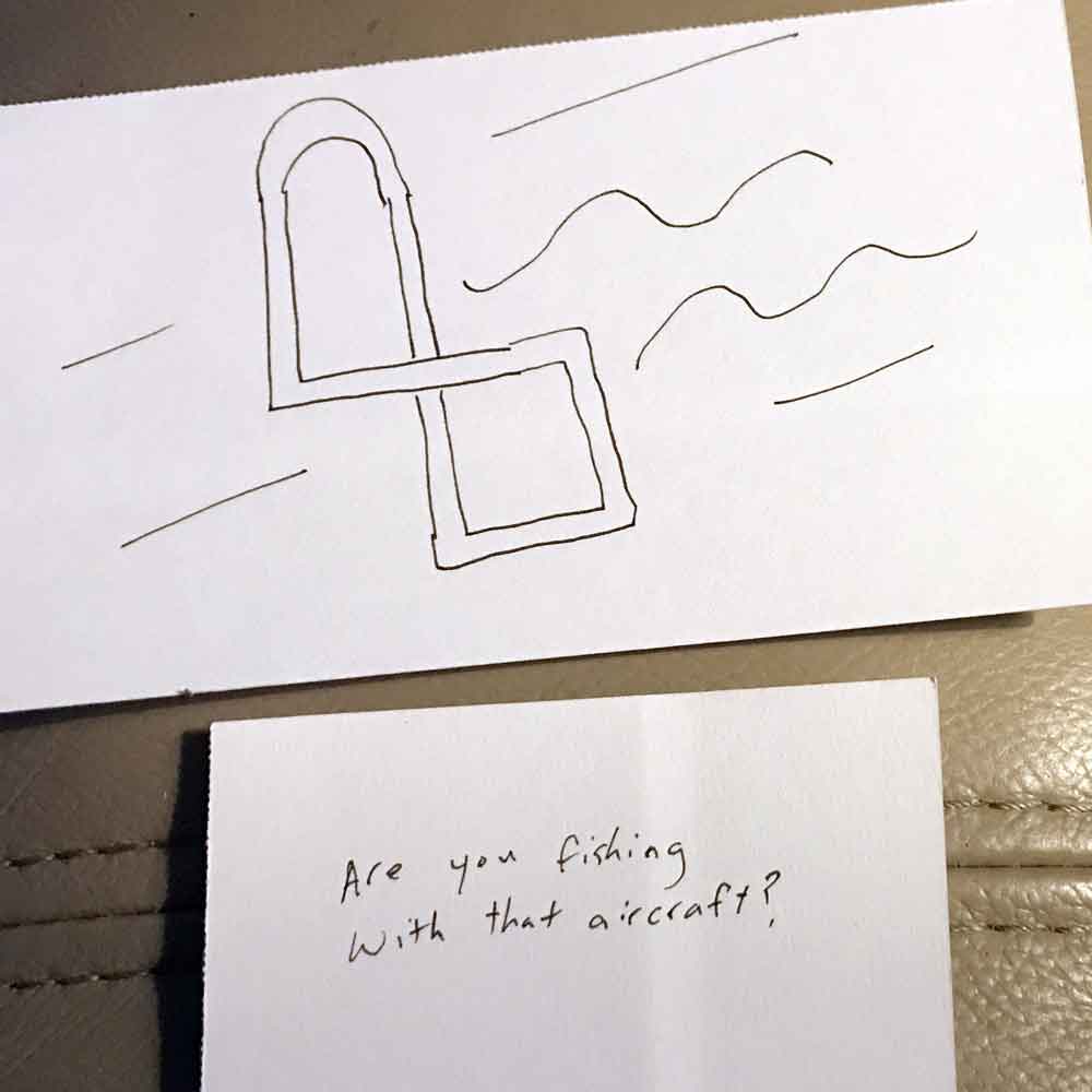
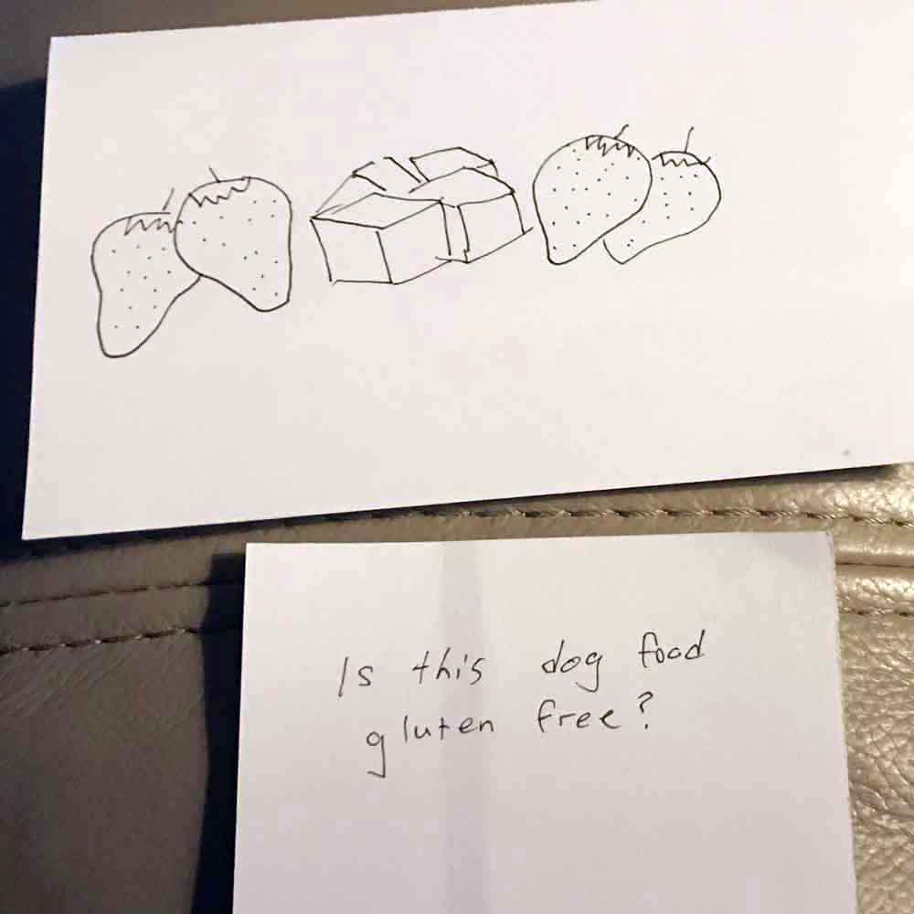
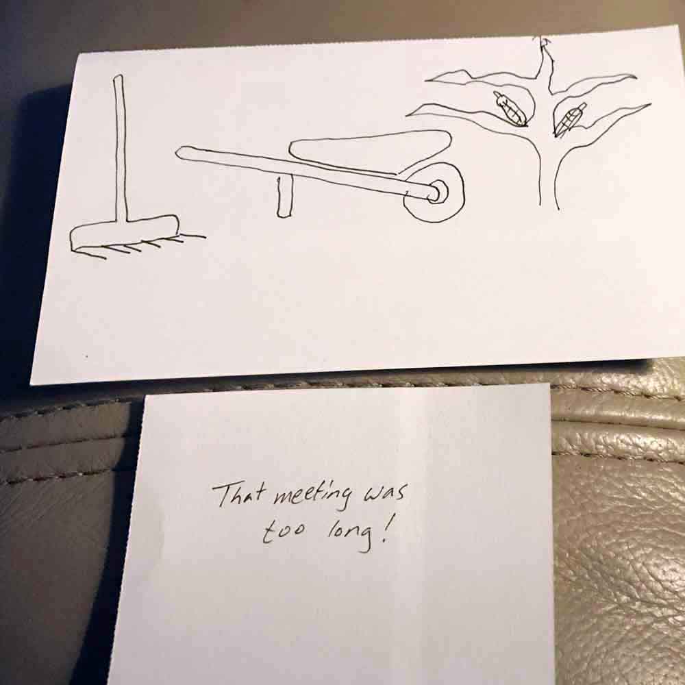
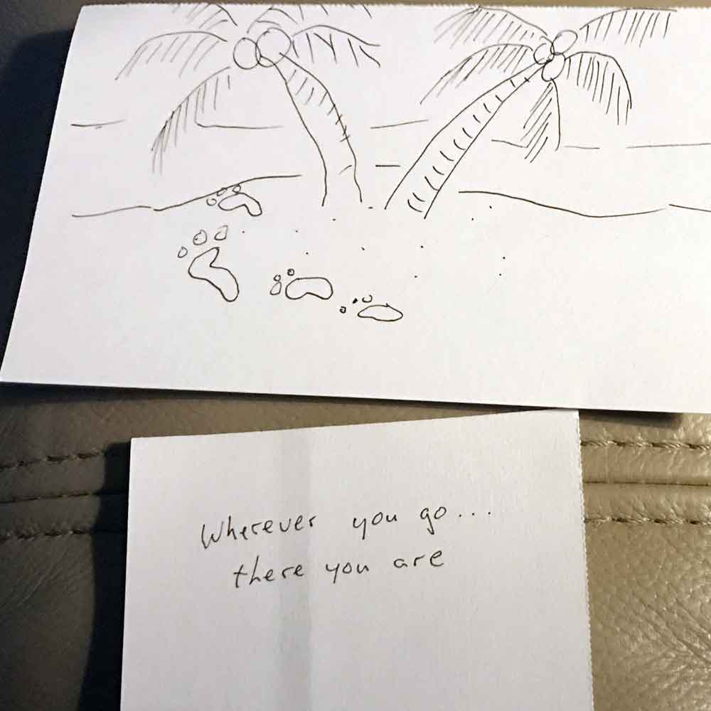
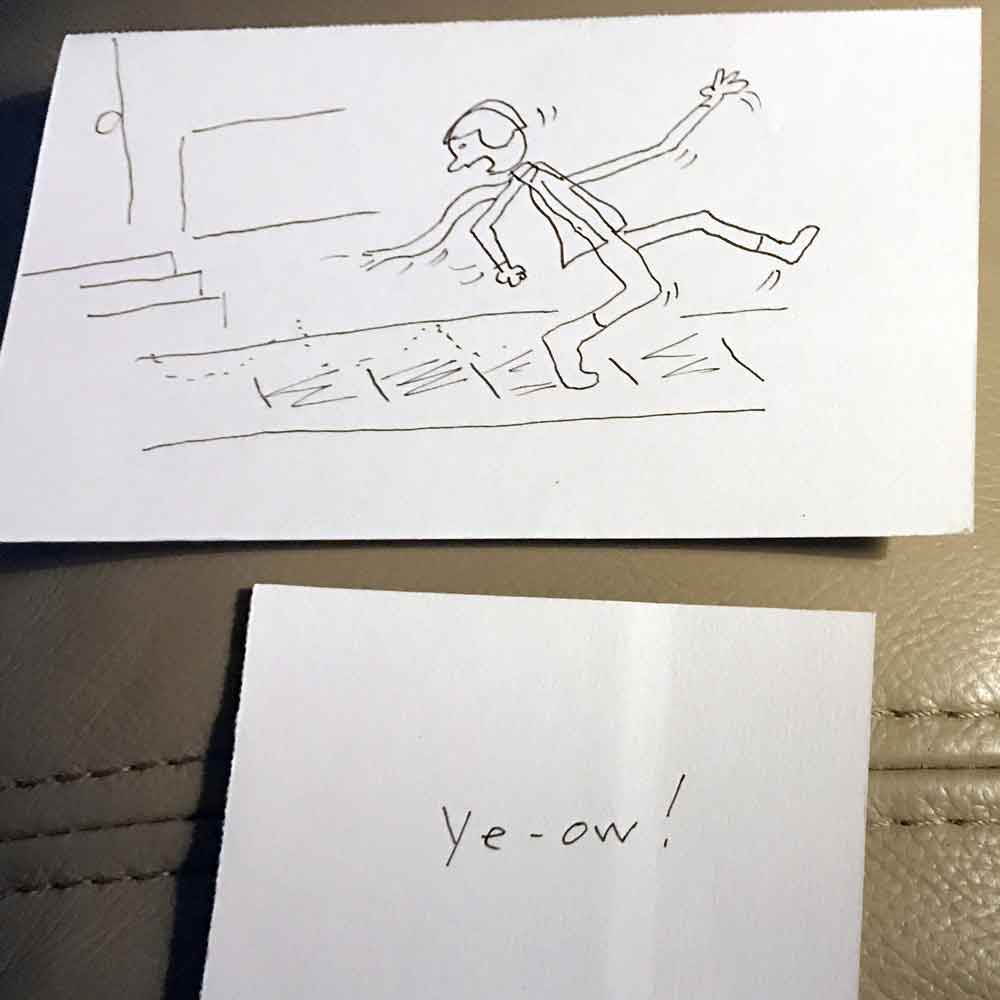
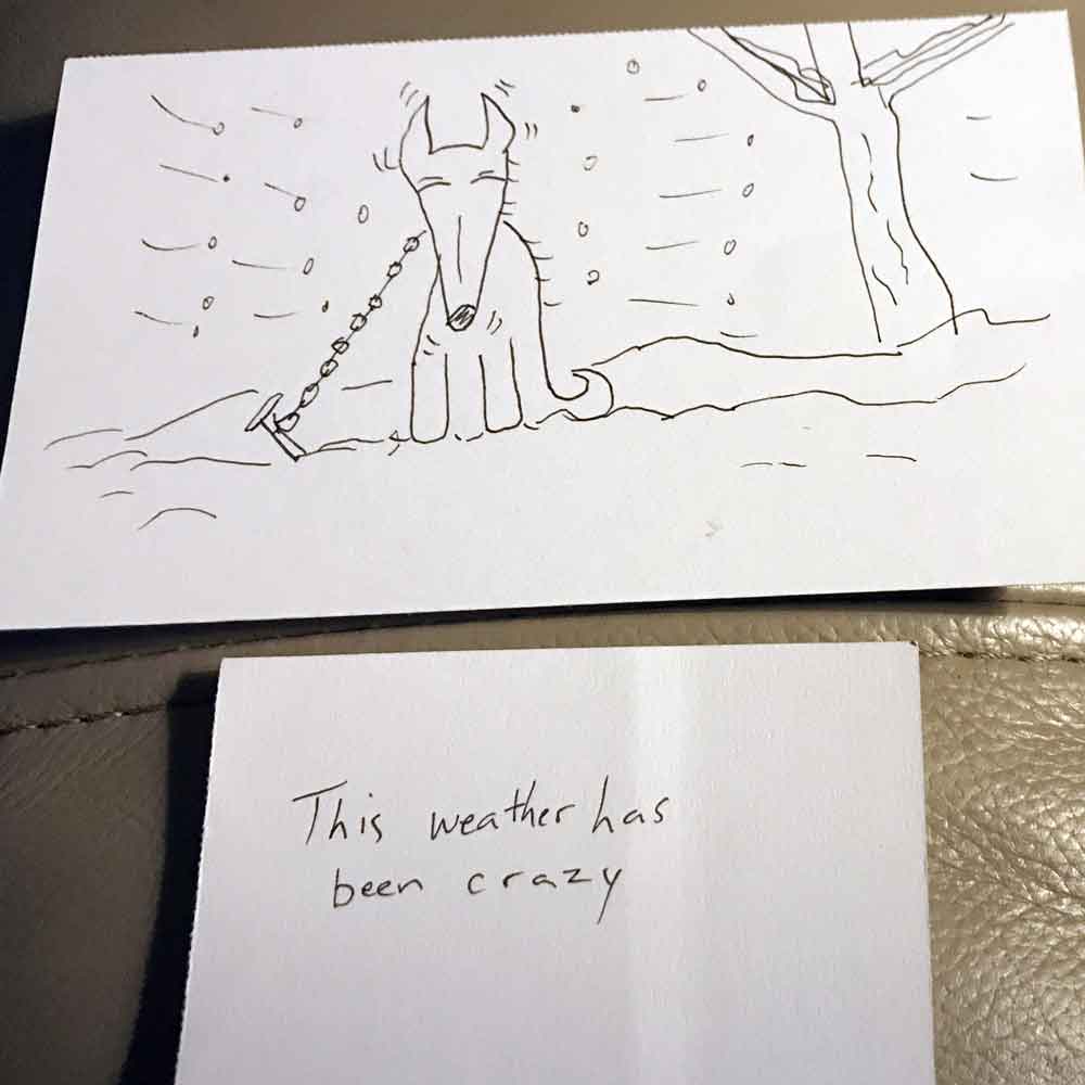
I’m working on Week 2 of the Brunetti Cartooning book. This week had three separate but related assignments. The first assignment was a writing assignment with various prompts like, “something you heard in public,” “something you said earlier,” and “an interjection.” I wrote these on an index card cut in half. The second assignment was to draw specific scenes with prompts like, “something abstract,” “the saddest thing you can think of,” and “something you dreamed about recently” on full-sized index cards. Then the third assignment was to put the written sayings with the pictures you drew. We were to play around and rearrange the pairings to ponder the results.

Below are my drawings and sayings, in various pairs. Some are nonsense and some are mildly amusing.